Saturday, July 28, 2012

7/28/12

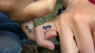
Well, I haven't done anything I'm really thrilled to death about in the last few days.  This is a "matching tattoo".  I think these two were sisters or something.  One thing everyone should know is that this is one of the places on the body to be least likely to heal out nicely.  Besides the bottom of the foot, there's not many places I would guarantee would look terrible when healed.

I used this "stencil stuff" on the sign on the right, but not on the left.  This stuff works too good.  You have to be careful where you use it because on something like this it's still going to be there when the tattoo is done.  The transfer is thicker than the lines I applied so it's thicker looking.  The only bad thing about this is the transfer may be filling holidays (blank spots) that you'd be able to see easily otherwise.


 This is what he described.  I wish I would have gotten the gray shading smoother in the rays.  I told him to come back after it heals.  Hopefully he does.  I think I could smooth everything out.


Hmm.  The picture's a little blurry when this is blown up.  The most important lesson I learned on this one, that I think I've been trying hard to conform to, is to keep the tattoo clean the whole time I'm tattooing. I think this would have come out better if I'd done that.  This is also the perfect style of tattoo to use the too good "stencil stuff" on.


This lady had the little flowers in the front and wanted something wispy and girly going up her leg.  I did some of the background stuff blurry to make the foreground stuff pop.  I'd like to spend more time on this.  I also redid the front flower (the two little blue ones behind it are new.  She LOVED the tattoo, in fact, she gave me a $100 tip... WOO HOO!


5 guys (a wrestling team) came in to get matching butt tattoos.  This is what they got.  Whatever.. 'nuff said.


Been a while since anyone has gotten a GD tattoo.  I wish I could have done the perimeter outline thicker... but all my tubes were used up and this lady was extremely impatient about dealing with the pain of the tattoo so I really just wanted to hurry up and get it done for her, which was, sadly, her biggest concern as well.


This is called a "snug",  apparently.  I did it today even though I've never seen it done.  For any interested in piercing here's how you do it... poke a hole in someone with a big needle, fill the hole with jewelry.  There.. you're ready to pierce.... OK< there's a little more than that to it, but for the most part that's the idea.  Keep it straight and treat every piercing like you care.  I actually think there a lot of fun, but then again, I've never really had anything go wrong with one yet.


I was really working on getting my B&G smooth on this.  The swirly filigree stuff on the bottom is shaky because she kept having some involuntary nerve shakes going on when I hit that area, down by the leathery part of the foot.


Fitzpatrick.  I did two back to back foot tattoos today.  I actually spelled her name wrong EEAK!  I freaked out (inside).  I played it cool though, what I did is put an "r" where the "z" is.  Sometimes when you're tattooing you're so focused on getting the lines right that you don't think about the fact that it's also a letter.  Well thank God the "z" fit perfectly over the "r".  She never new and was absolutely thrilled to death with the tattoo!

Thanks again for checking out my post.


BRB


Sunday, July 22, 2012

7/22/12


I have a lot to write about.  It's been a few days.  I've been thinking a lot about the blog and want to write a couple of posts about my drawing technique and my theories about art in general.  But first I'm gonna talk about a few tattoos I've done lately.


This is a lioness I tattooed on my wife.  It took 4 hours and I'm pretty proud of it.  Some of the things I liked are the eyes, and nose.  I think they came out pretty good.  I like the transition of the colors in the sky.  I'll use those again for sure.  It's Eternal's smoke and mint green.  I had a hard time getting some of the colors I had planned on using to show up because she's got some pretty brown skin.  I learned that yellow doesn't show up on brown very well.  I'd like to do another session when it heals.  I think I could improve the looks of the snout.  Also in the places where I packed in white it started seeping that night.

You can see the white ink seeping out, especially under the eye.
Now it has been a few days (6) and it's almost completely healed already except there are scabs on the white and the skin is dry and flaky.   Here's my theory on they white, I (like most) tend to pack in the white extra hard because it doesn't always show up when it heals.  I think that the extra trauma to the skin actually allows for the ink to reject easier, countering the effect.  This is something I'll have to play around with in the future.  Please comment if you have thoughts on it.  She felt that it was a relatively low pain tattoo.  I'll post pics when it's completely healed.


Click to enalrge
 This is a Bluebird brand recording studio mic. Overall I really like it and the customer loves it, plus I had a lot of fun doing it.  I tried to draw it in a way that it looked like something was going on, like there is action, not just a stagnant object.
  There's some music notes in the background which I wanted to just do a subtle gray shade on, but I was using too hard hitting of a machine so I couldn't do what I wanted.  I told him to come back when it's healed and let me clean it up a bit.  I liked the way the blues came out on the handle and the over all composition was good.  It was hard to work it in with the other random designs he had on his arm already.  I think it would have been a better tattoo if I could have gotten some of the lines more perfect.  I want to get an ellipse stencil plate for drawing things lie this.  If the transfer would have been, like engineer perfect, the tattoo would be better.  Aim small miss small.  I wish I had the patience and skills to render my line-work in illustrator.  I really should try doing a few tattoos that way and see how they come out.


There's no hard lines on the feathers inside the wings.  I was planning on doing this much larger, the customer originally wanted this to fill his whole upper arm but decided to reduce it to 80% when he arrived.  I wish he wouldn't have done that cause I had a lot more cool detail planned for it.  I think I need to order more browns.  I also realized after looking at pics that his right (the eagle's left) wing is a lot darker than the other one.  But the actual light is coming from the left so it might not be like that on the real tattoo.


I'm wearing this, I didn't tattoo it.

I got this Banksy design done on my inner arm.  Alex from Rochester Tattoo did it.  I think he did a great job.  I was also impressed by how black his black healed out.  He said he uses some "Polynesian tribal black".  I don't know what that is but I want some!

All right that's it for today.  As always, thanks for checking out my pics and skimming through my psycho-babel.


BRB


Saturday, July 14, 2012

7/14/12

Today was awesome!  This guy had his name on his back, and added a random dear head in the center of his back.  He has plans to put scenery around the buck, but didn't think it made much sense that his name was floating above it.  I suggested puting a banner around it to set it apart from everything else.


Then I did this honey badger... he don't care!.  That's my B&G set up on the left.  Left to right, dark to light always.  One cup is solid black, the next is half full, then one where the bottom of the cup is covered and one with one drip of black, topped off with water.  Oh, and of course white.  The blood is the location where I set my pinky to rest my hand on the tray when I dip for ink.


Canadian pride...I don't get it.  (JK)
When I do a gradient from black to another color I fill an area with solid black and whip it out into the area where I'm going to put color.  I don't rinse my needle I just dip in color because there's enough black left to tint the ink in my tube, but not the cup.  As I work my way away from the black the ink gets (in this case) redder.  If I was smarter I wouldn't have given the black such a hard edge when I filled it in, that way I could have worked more red into the black area, resulting in a smoother gradient, without over working the skin.


Lips.  This is done in pink ink, it would have looked better in a darker color, like red.  Oh well.  He likes it.


One cool trick I learned this week is to drag the working area of the skin away from bones when tattooing.  I was working on a color bone and I have a tendency to pull towards my left hand when stretching the skin.  The customer actually asked me if I could pull down instead, by doing this I was able to move the whole tattoo away form the bone, which, I'm sure, greatly increased his endurance, allowing me to tattoo longer, have more fun and make more money!  I'll be focusing on that whenever it's an option from now on.


Before and after pics of a cover-up I did
a few weeks ago, I didn't have
my camera that day.

Thursday, July 12, 2012

7/13/12


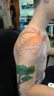
This is a sleeve I'm working on... half sleeve.  I'm pretty excited about it.


This guy loves snow boarding.  He came in with an idea of doing a sun at the cap of his arm, with rays spreading out, through clouds and fading behind some mountain caps.  In front of the distant snow covered mountains is a small hill with ski slopes on it and some kind of foreground element.  Plus he thought it would be cool to throw some roses in it somehow.  We did some searching around on the internet and I put together this reference sheet.


I know, I'm extremely ambitious using Nick Baxter's work for reference.  But I shoot for the stars baby!  Here's a little video clip of me drawing on Kyle.


I was trying to hold my phone with my left hand and actually focus on doing a good job with my right hand and not really let the customer know what I was doing cause I felt kind of stupid.

Today we laid in the tree and started the roses.  Here's what we've got so far.


 And the first session of the flowers.  I intend to ad some pedals without hardlines, and tighten up what's here, plus add some out of focus green leaves to close the gap between the rose and the tree and also to balance out the composition.  I think I'm done with the tree pretty much.  Most of the rest of the tattoo will be hardline free.


He sat for 4 hours straight, he was great.  This was the most fun I've had in a long time.  I told him while we were cleaning up that it was to me what snowboarding must be like to him.  I love my job!


He came back the next day for more pain.  Another hour and a half.  We lined the sun with a thick red outline and colored it in oranges.  Then we outlined the clouds with a wash, they all look horizontal when you're looking at the tattoo straight on, the one in the back looks like it comes in at a strange angle in that pic.  The mountain range is lined in "smoke", a blue gray from eternal.

Wednesday, July 11, 2012

What you're allowed to get

I'm tired of tattoo artists telling customers what they're allowed to get!  Don't get me wrong, I definitely have a say in what happens on my side of the machine, and that means quality control.  If someone brings in terrible reference art, that doesn't mean give them a terrible tattoo!  Fix it up to the best of your ability and give it your twist/flair.  Make it yours, and make it good.

What I'm talking about is tattooers telling a customer that their tattoo HAS to face a certain way, front, back, up, down, or be a certain style (ie; traditional). I do, however, believe it is a tattoo artist's responsibility to explain what is best (or at least, most common), more socially acceptable and smarter.  For example, letting them know that their wrist tattoo is going to look upside down to everyone else, unless they walk around with their hand up all day is polite.  Telling them that they have to get it the way you like it is arrogant!  The same thing goes for tattoos that are going in places they won't heal well, like the bottom of the foot or the ring finger. 

Many will claim that because their name is associated with the tattoo they refuse to do certain things.  Make sure the customer is treated with respect in this manor.  It's your choice not to do "upside down" tattoos, you don't have to belittle the customer about it.  Just say, "I really think a lot of people are going to think I don't know what I'm doing if I do that, if you're not willing to do it the other way (other location, whatever) then I'm afraid you're going to have to find someone else to do it." As opposed to "No, you can't get it that way."

I have to be honest, I like out-of-the-box tattoos a lot.  Tattoos that look like a sketch, or scribbles, or that are randomly and uniquely placed.  Big crazy wild solid black whatever the heck the collector wanted kind of tattoos.  Tattoos that say "I don't give a crap what you think, it's mine!"  Which is exactly what a tattoo should say.

Now on a blatantly hypocritical note, there's certain content I refuse to do.  That's a little different.  I won't do racist or demonic tattoos.  I won't tattoo a pot leaf on you or anything vile or vulgar.  For some people that doesn't leave much.  But it's not because I think you're an idiot or you don't have every right to put those things on yourself, it's because I believe art should enrich everyone's life and I actually believe tattoos can make the world a better place, as long as they're not magnifying violent tendencies or encouraging self destruction.

Tuesday, July 10, 2012

7/10/12

Before

AFTER

This is the first session of a pot leaf cover-up.  I think it would have looked much better if the branches could go up further and taper off a little better, unfortunately that wasn't an option.  It's a really fun piece.  I can't wait to pack it with color and get some highlights in it!


This guy already had the cross on the left and wanted one to match it on his other arm with a "fiery red skull".  I didn't like the idea, but I couldn't talk him out of it, so the next best thing I can do is do the best I could to do it nice.  It was hard to match the shading on the other one, cause you can't really look at the other arm while your tattooing...the...other...arm, whatever you get the point!


This customer came in with a strangely placed faded tree frog floating on her foot.  She wanted a lilly pad "or something" under it.  I thought she'd have the same problem with the lilly pad, it would also look like it was oddly placed and just kind of floating there, so I suggested this tree branch with a little flower and some background color to make it pop.  She loved it and I have to admit I'm pretty proud of it my damn self!  Plus it was a lot of fun!

Friday, July 6, 2012


Normally I don't like touching other people's tattoos but I tried to talk this guy into going back to his original artist and he refused.  He had the ship and clouds done up the street and the guy did this weird ugly shading technique which you can see off to the side of this picture (below).

Those black whip outs came out of every intersection of the cloud all the way around and the guy absolutely hated it.  We couldn't come up with much to cover it with so we had to add more clouds.  He is happy with the clouds.  He also didn't like the sky behind the ship, it was just empty with teeny tiny little corny "m" birds.  He was very unhappy with the work he got at that other shop and wasn't going to be talked into going back.


Along with that I also did a cover-up (I'll finish and post a pic of it tomorrow) and these letters on the foot.


Needles

I order needles from Cam supply because it's easy, they have a huge selection, they're never out and they're cheap.  I have heard a lot of people talk crap about the quality of their needles, but I inspect every needle with an eye loop before tattooing, and I have never found a bad needle from them.  So either I have no idea what I'm looking for (which is not the case) or people are just assuming that they're bad needles because they are cheap and their logo is embarrassingly terrible!

 I keep on hand Supertight 3, 5, and 7 rounds (I don't like the triple tight) and an 8 round shader, which I often line with and also often color with.  It's by far the most versatile needle.  I can get smooth gradients with it and sharp clean lines.  When ever possible I try to use at least two different lining needles on a tattoo.  The variation in line width gives tattoos more dimension.   This variation can often be created by double lining certain areas, and some times that will give the line a more natural organic look, but that natural look is often misconstrued as week, or sloppy line-work.

For mags I use 9s, 11s, 13, and a couple types of 7s.  Anything bigger than a 9 has to be curved for me, or I hate it!

These are 17 mag bugpins with a curved end.  It's what Niko Hurtado makes to do his full color portraits.  They're available through Cam supply for about $15 (box of 50, that's like .30 a needle).  I've used them a few times already, they're amazing, they lay color in so smooth, you barely have to push it in, I use my black and gray machine mostly.
Another thing I've always wanted to try is testing the difference between long and short taper needles.  The theory is that the long taper (sharp) needles will make smaller holes and smoother gradients in color blending and B&G work, while the short (natural) taper needles slam in color and are great for solid blocks.  I also have shown here a bugpin 9 mag (which is going to sit in a 7 mag tube).  If you don't know what bug pin needles are, they are actually smaller diameter pins laid in the exact same configuration as larger ones, so each needle pokes more, smaller, closer together holes in the skin.  I had an opportunity to use the bugpin 9 on my chrome wrench, piston memorial tattoo yesterday.  I was absolutely thrilled to death with it, I hope I get to do some more ink today!  I have a customer who came in yesterday asking about a half sleeve with a landscape.  It would be perfect for these new needles I've been playing with.